In a market flooded by sophisticated, slick or trendy labels, how do you make sure yours is the one consumers reach for? The advice may be to never judge a book by its cover, but the truth is most consumers select a wine based on its label.
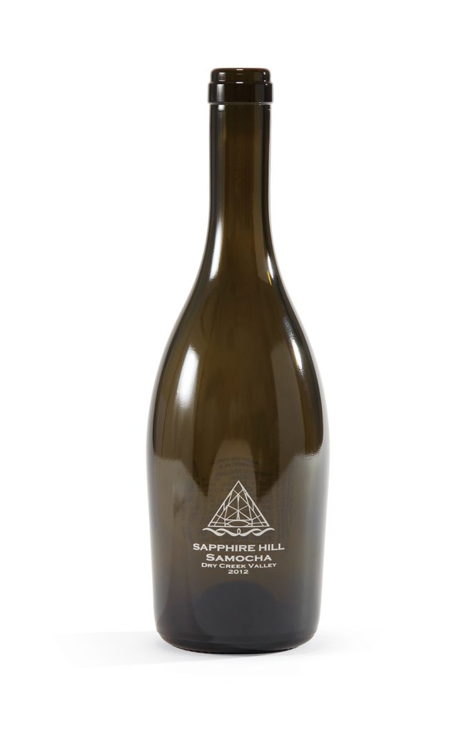
From a marketing standpoint, an attractive, eye-catching label is almost as important as the quality of the wine inside. Well-designed labels are essential for moving your product from the shelf to the consumer’s home, particularly those customers who have decided to try something new. If you want a label that will “pop” off the shelf, a lot of creative thinking and design must go into it.
Some graphic designers who specialize in wine label design believe your wine label must work on three levels:
The store shelves are packed with bottles of Cabernet, Chardonnay and Pinot Grigio, many sporting award labels. Choosing a bottle can be downright baffling for consumers.
A study done by Cal Poly found that wine buyers get their first impression from a bottle’s label. Researchers learned that while people consider the quality, good value and varietal of the wine, they also want a unique, eye-catching and colorful label. So what specific details should you keep in mind when designing a label meant to quickly catch the consumer’s interest?
If your brand wants to develop packaging that grabs attention, does justice to your product, and drives consumer preference, you need to understand what catches the eye and compels customers to pick up your wine on their way to the register. If you’re interested in learning more about how screen printed labels are the perfect way to uniquely represent your brand in the marketplace, contact us today. We’ll show you how we can help set your brand apart from the rest.
707.536.1630
sales@bottleprint.com